UX Inspiration
Last year I watched a Malayalam film named Keedam (transl. Pest). Directed by Rahul Riji Nair, the film follows a cybersecurity expert taking on some criminals using technology and her skills.
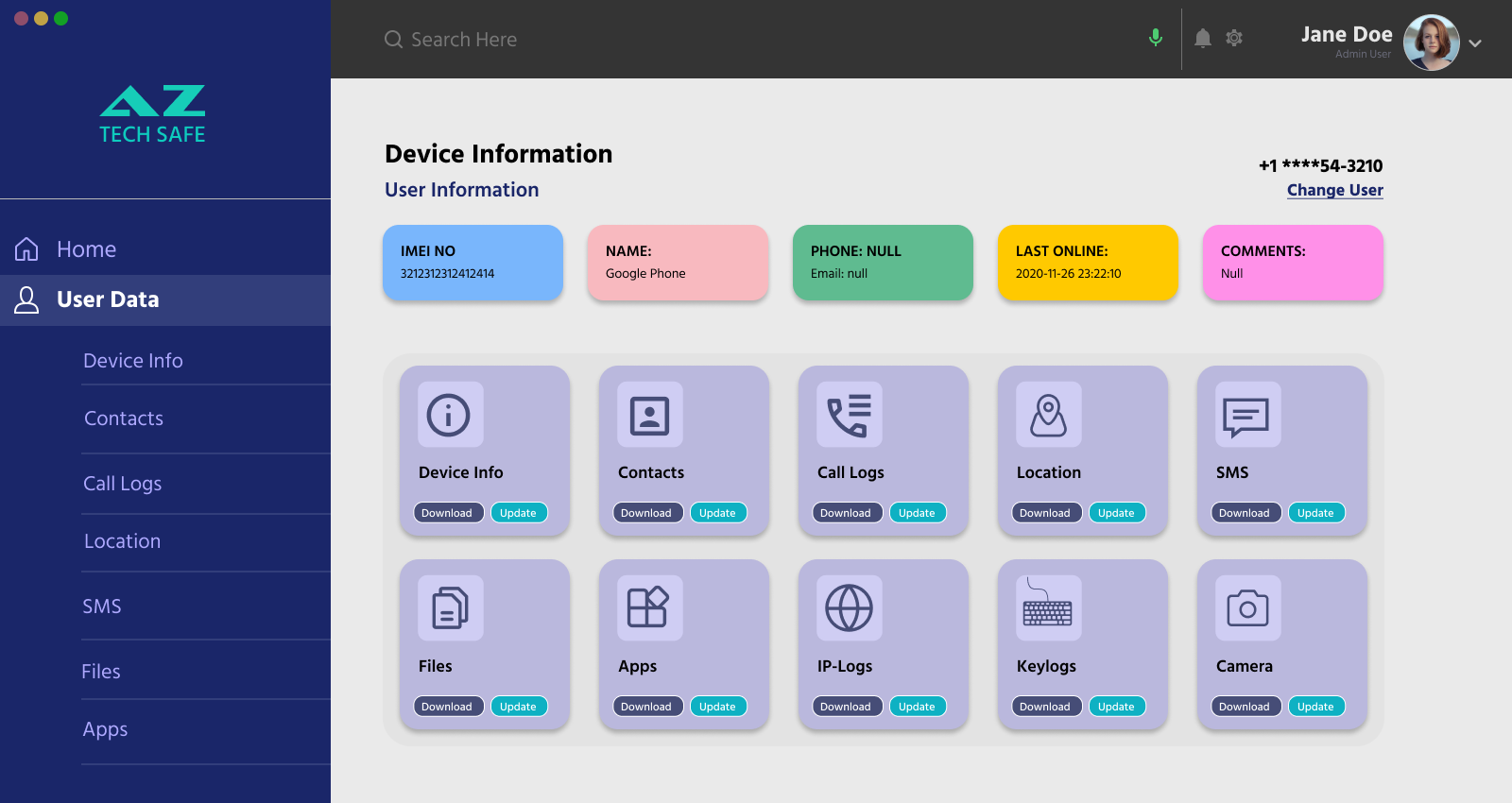
More than anything what captivated me was the clean and simple user interface of an application that is depicted, and is shown in many of the scenes in the film.
Given that this application is a central part of the plot, we can see that a lot of attention as given to it, so that a common person who has maybe used a mobile phone would be able to understand this in the context of the film. It even looks like a complete application, with most of the features being used by the characters.
I was able to recrate the interface in Figma (shown below), albeit with some modifications (e.g; darker background for the top bar to separate from the content, some improved spacing etc)
 A recreated UX interface from the film ‘Keedam (2022)’
What we see most of the time is a Dashboard, although the same items are always available as a side menu. It appears that once a user / phone number is selected, the relevant details are displayed in distinct colorful boxes at the top. And certain actions that can be taken displayed like cards below it. By looking at the way the application is interacted with, it actually looks more like an Angular or React web app.
Dashboards in UX
After the first post on this topic, I got a chance to discuss these ideas with a fellow professional UX Designer and he was of the opinion that in most of the cases we see some sort of Dashboard interfaces shown in movies. Be it some tool that the protagonists use or a team using a dashboard for easy information lookup or monitoring.
 Source: Behance.net
Dashboards in Sci-Fi Films
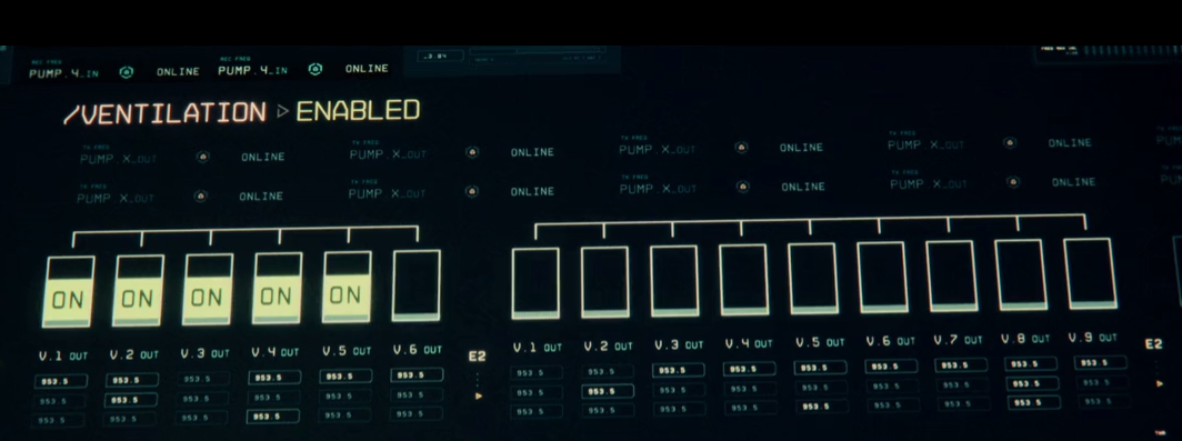
Another example is from the film The Cloverfield Paradox, which is a Sci-Fi movie happening on a space ship. Although the interface is more complicated than the earlier example, I think they highlight the key elements where the audience needs to concetrate. For example, the title and the status of some ventiation systems in the screenshot below.
 This screenshot is used under the doctrine of ‘fair use’ for commentary. The use of this material is intended for example in an analysis article and does not infringe upon the copyright of ‘Bad Robot Productions’. All trademarks and copyrights are the property of their respective owners.
Dashboards can be used to visualize data in a way that is easily digestible for the audience. It could be tracking the progress of a task, monitoring vital signs, or showcasing real-time events, dashboards provide a visual representation that enhances the audience’s understanding.
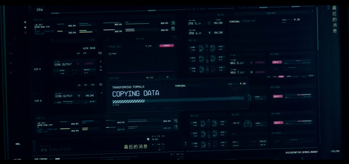
In the below screenshot, there is a simple progress bar overlay which shows a visual progress of copying some data.
 This screenshot is used under the doctrine of ‘fair use’ for commentary. The use of this material is intended for example in an analysis article and does not infringe upon the copyright of ‘Bad Robot Productions’. All trademarks and copyrights are the property of their respective owners.
Although the entire UI is complicated, the text Copying Data and a moving progress bar are prominent and conveys the action to the auidence. Conventionally such a dialog box would have a Cancel button atleast, but they have even ommitted anything considered extra for the context.
Conclusion
Including dashboards in movies can be a powerful narrative tool to convey information, build suspense, and engage the audience. In some cases, they can be story telling devices that communicate critical plot elements.
In Addition, a well-designed dashboard not only serves its functional purpose but also adds an aesthetic layer to the film, making it visually appealing and memorable.
References
References are linked inline within the article.