Design Notes \ Tutorials
December 2006
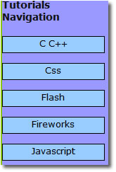
One of the most important sections in this site is the tutorials. Since theoetically this section should have a lot of visitors, the navigation had to be designed very carefully as it should be easy to use. It could be used to get the visitors to other parts of the website and thus market it. Since the tutorials navigation is the most important, we gave more importance to it, thus making it visibly big for the user. It is shown on the left.It clearly indicates the tutorial topics that are provided on this minisite.
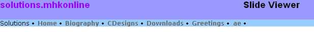
We started with a sketch on paper and developed it into a sleek design. It was originally following the Slide Viewer's main nav as shown below. It doesn't give much importance to the main navigation, but it is visible. It is based on the header design for the home page. The header for the tutorials section takes so little space that we were able to use a lot of space for contents and other details.
Lets take a look into how we transformed a simple idea into the main navigation of the Tutorials section.
From the beginnig the idea was to give a color to each section. Having assigned that, we couldn't get a color that would match with all of them for the separator and for the header text. The solution finally was 'Silver'. It matches with almost any color and the tutorials header came to life. We also provided a small content box for dsiplaying a random tutorial from among all the tutorials provided.

Done at AE Labs.